Your Shopify Store Is Getting Traffic. So Why Aren't More People Buying?
You've invested in the brand. You've built the website. You're driving traffic through paid media, SEO and social. But when visitors land on your Shopify store, too many leave without buying. Sound familiar?
For ecommerce brands, getting customers through the door is only half the challenge. The real opportunity lies in what happens once they arrive.
With customer acquisition costs putting pressure on marketing budgets, improving your conversion rate can be one of the most commercially valuable things you do. And often, the biggest opportunities aren't hiding in a complete website redesign. They're sitting in the details of your existing customer journey.
At twotwentyseven, we work with ambitious ecommerce brands to identify those opportunities, test improvements and turn more visitors into customers.
Here are six areas we'd look at first.
1. Your Homepage Isn't Making It Easy Enough to Shop
Your homepage has a big job to do.
It needs to communicate who you are, what you sell, why customers should trust you and where they should go next. All within a matter of seconds.
Yet many Shopify homepages are designed primarily around brand storytelling, with the actual shopping experience taking a back seat.
Beautiful photography and bold messaging are important, but customers also need a clear route into your products.
What we'd look at:
-
Clear, compelling messaging that communicates your value proposition immediately.
-
Easy access to bestselling products, popular categories and new arrivals.
-
Promotional messaging that highlights relevant offers without overwhelming the experience.
-
Strong calls to action that make the next step obvious.
-
Trust signals that give first-time visitors confidence in the brand.
A great homepage doesn't make customers choose between experiencing your brand and shopping your products. It does both.
Putting It Into Practice: Reflex Nutrition
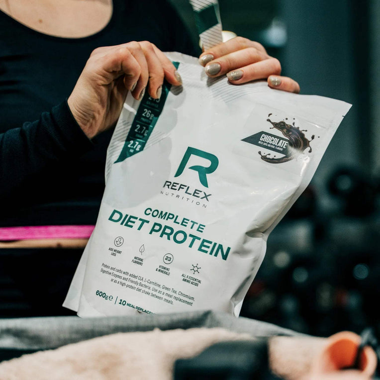
As part of our ongoing conversion optimisation work with Reflex Nutrition, we redesigned the homepage to better showcase the breadth of its product range, highlight key promotional opportunities and reinforce the strength of the brand.
The goal was simple: make it easier for customers to discover the right products while creating a stronger foundation for conversion.
2. Your Product Pages Are Informative, But Are They Persuasive?
Your product detail page (PDP) is one of the most important commercial pages on your website.
It's where interest becomes intent, and where customers decide whether your product is worth their money.
But too many PDPs simply present information rather than actively helping customers make a purchasing decision.
A strong product page should answer the questions customers are asking before they even have to ask them.
Is this right for me? What makes it different? How much should I buy? Is there a better-value option? Can I trust this product?
What we'd look at:
-
Clear product benefits rather than just lists of features.
-
High-quality imagery that helps customers understand the product.
-
Reviews, ratings and other relevant trust signals.
-
Prominent pricing, availability and delivery information.
-
Bundle and save opportunities that encourage larger purchases.
-
Subscription options that make repeat purchasing easier.
-
A clear, accessible add-to-cart experience.
Making More of Every Product Page
For Reflex Nutrition, our PDP redesign puts bundle and save initiatives front and centre, helping customers quickly understand the value of purchasing more.
Rather than treating upselling as an afterthought, the experience makes relevant savings opportunities part of the core purchasing journey.
This is where conversion rate optimisation and average order value (AOV) work together.
It's not just about convincing more people to buy. It's about helping customers find the purchase option that delivers the most value for them.
3. Your Cart Is Slowing Customers Down
Think about the journey your customer has taken.
They've discovered a product, explored the details, chosen their options and clicked add to cart.
They're interested. They're engaged. They're getting closer to purchasing.
So why interrupt that momentum?
Traditional cart pages can introduce unnecessary navigation and friction, particularly when customers want to continue shopping or quickly review their basket.
A well-designed slide-out cart can create a much more seamless experience.
What we'd look at:
-
Instant cart access without redirecting customers away from the page.
-
Simple quantity adjustments and product removal.
-
Clear order totals and delivery information.
-
Relevant cross-sell opportunities that don't distract from checkout.
-
A prominent, easy-to-find checkout button.
-
Clear messaging around any delivery thresholds or savings.
For Reflex Nutrition, we introduced a new pop-out cart designed to keep customers moving through the shopping journey.
The objective was to remove unnecessary steps, maintain shopping momentum and make the path to checkout as straightforward as possible.
Of course, a slide-out cart isn't automatically better for every brand. The important thing is understanding how your customers shop and testing which experience works best.
4. You're Missing Opportunities to Increase Basket Value
Conversion rate gets a lot of attention, but it's only one part of the revenue equation.
Consider two Shopify stores with identical traffic and conversion rates. If one consistently generates a higher average order value, it can produce significantly more revenue from the same number of visitors.
And you don't necessarily need aggressive discounts to achieve it.
There are smarter ways to encourage customers to spend more.
Opportunities worth exploring:
-
Bundles: Group complementary products into a convenient, better-value purchase.
-
Volume incentives: Reward customers for buying more of products they already love.
-
Free delivery thresholds: Give customers a clear reason to add another item.
-
Relevant cross-sells: Recommend products that genuinely complement what's already in the basket.
-
Subscriptions: Make repeat purchasing convenient while creating opportunities for stronger lifetime value.
The key is relevance.
Customers don't want to feel like they're being pushed to spend more. They want to feel like they're making a better purchasing decision.
The most effective upsell experiences deliver value to the customer and the business.
5. You're Making Customers Work Too Hard
One of the biggest conversion killers is friction.
Not necessarily a broken button or a dramatic technical issue. Often, it's the accumulation of small frustrations.
A confusing navigation menu. Too many product options. Important information hidden too far down the page. A promotional message that isn't clear. A checkout journey that feels longer than it should.
Individually, these issues might seem insignificant.
Together, they can make shopping unnecessarily difficult.
And customers rarely tell you why they've left.
What we'd investigate:
-
Where customers drop off between product views, add to cart and checkout.
-
Whether navigation and product filtering help customers find what they need.
-
How the experience performs across different devices.
-
Whether important purchasing information is easy to find.
-
Whether page performance is creating delays.
-
How accessible the website is for different customers.
Using Shopify analytics, GA4, heatmaps, session recordings and customer behaviour data, we can start to understand where friction exists.
Then comes the important part: deciding what to improve first.
6. You're Making Changes Without Testing What Works
This is where CRO becomes a long-term growth strategy rather than a collection of website tweaks.
It's easy to make assumptions about what customers want.
A bigger button will convert better. A shorter homepage will perform better. A new layout will increase sales.
But what works for one brand won't necessarily work for another.
And sometimes, the results surprise you.
That's why we believe in a continuous cycle of analysis, hypothesis, experimentation and improvement.
Our approach is simple:
-
Understand: Review performance data and customer behaviour to identify opportunities.
-
Prioritise: Focus on changes with the strongest potential commercial impact.
-
Improve: Design and develop solutions around a clear hypothesis.
-
Test: Where appropriate, run controlled experiments to understand the impact.
-
Learn: Use the results to inform the next round of improvements.
Not every test will win, and that's part of the process.
The goal isn't to make constant changes for the sake of it. It's to build a better understanding of your customers and make more informed decisions over time.
Small Improvements. Bigger Commercial Impact.
Let's put the opportunity into perspective.
Imagine your Shopify store attracts 100,000 visitors per month, with an average order value of £50.
| Metric | Before CRO | After CRO |
|---|---|---|
| Monthly visitors | 100,000 | 100,000 |
| Conversion rate | 2.0% | 2.5% |
| Monthly orders | 2,000 | 2,500 |
| Average order value | £50 | £50 |
| Monthly revenue | £100,000 | £125,000 |
That's £25,000 in additional monthly revenue, without increasing traffic or advertising spend.
It's an illustrative example, of course. Real-world performance depends on your audience, product, margins and many other factors.
But it demonstrates why improving the experience for customers already visiting your store deserves just as much attention as acquiring new ones.
And if you're able to improve average order value alongside conversion rate, the commercial opportunity becomes even more interesting.
Your Website Should Never Stand Still
The best-performing ecommerce websites aren't necessarily the ones with the biggest budgets or the most dramatic redesigns.
They're the ones that keep learning.
Customer expectations change. Shopping behaviours evolve. New technologies create opportunities. And your product range, marketing strategy and business priorities are constantly moving forward.
Your Shopify store needs to evolve with them.
At twotwentyseven, we work with brands including Reflex Nutrition, Fever-Tree and Planthood to design, develop and continually optimise ecommerce experiences that support long-term growth.
From focused CRO improvements to ongoing experimentation and strategic development, we help brands make more of the traffic they're already attracting.
Getting customers to your website is expensive. Making their experience better shouldn't be an afterthought.
Ready to Find Out What's Holding Your Shopify Store Back?
If your Shopify store is attracting visitors but not converting as well as you'd like, we'd love to take a look.
Get in touch with twotwentyseven to explore how we can improve your customer experience, increase conversion and unlock more value from your existing traffic.